11 Examples of Design Thinking Inspired Products & Services

From health to technology, design thinking has inspired human-centered products across a wide range of fields and industries. Now more than ever, startups, nonprofits, and large corporations are going out into the real world to understand their users’ needs and uncover insights that lead to innovative ideas. Here are some of our favorite examples of products and services created using design thinking.
Examples of Successful Design Thinking Projects
1. PillPack, a prescription home-delivery system

For many older adults, keeping track of when to take medications can be challenging and time-consuming. PillPack, an online pharmacy and a former startup-in-residence at IDEO that was acquired by Amazon, has sought to make the experience easier. The company created a prescription home-delivery system that organizes medications into presorted, easy-to-open packets labeled by date and time—and sends them straight to your door.
Instead of having medications in five different prescription bottles (in addition to vitamins, supplements, and over-the-counter medicine) and having to remember when and how often to take them, you receive them all in packets with clearly marked time stamps that you tear open at specific times. By understanding customers’ needs and pain points, PillPack was able to design a more seamless and convenient prescription experience.
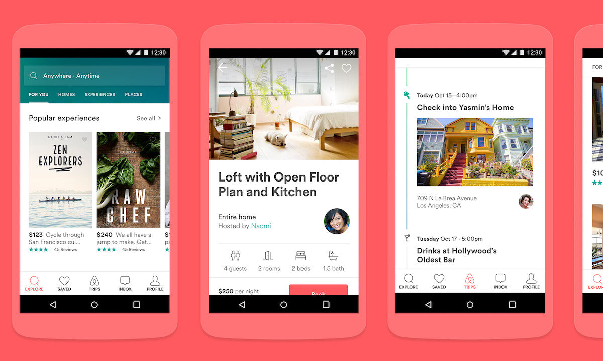
2. Airbnb, the online platform that lets you stay anywhere

Image Source: Google Design
When Airbnb was founded in 2008, homestays weren’t as common as they are today. In the company’s early days, people weren’t booking rooms, and revenue wasn’t increasing beyond $200 per week. Airbnb is now a multibillion dollar online platform for lodging and accomodations, but it was a moment of learning about their users that the founders saw as a turning point in getting the company to where it is today.
The early Airbnb team believed that people were hesitant to book through the platform because photos of listings were low resolution and didn’t effectively show users where they would be staying. As a result, they traveled to New York to spend time with hosts and help them take high quality photos, and revenue doubled. According to Joe Gebbia, the designer of the group, that instance of meeting their users changed the trajectory of the business. Today, Airbnb continues to encourage its employees to test ideas and understand the people who use their platform.
3. Willow, the first wearable breast pump

For new moms, breast pumping is a very personal part of motherhood; yet, it’s often an inconvenient process that involves many unwieldy tubes and bottles. To address this, Willow teamed up with researchers, designers, and engineers at Function Engineering and IDEO to reimagine the breast pumping experience. The team designed a product that empowers mothers to be both mobile and discreet with a simple, cordless pump that fits into a bra.
Willow followed a human-centered approach, interviewing dozens of mothers with a wide range of experiences and using insights on their breast pumping routines to build more than 60 prototypes. They found that women wanted a product that felt more like an accessory than a mechanical device, would allow them to pump anywhere, and was easy to assemble and clean. These learnings led Willow to a final pump design that makes breast pumping easy and convenient.
4. Uber Eats, an app that’s redefining food delivery

Food delivery apps have changed how we eat. Uber Eats connects people to restaurants in cities all over the world, and each place has its own individual food culture and ecosystem. Uber realized that to create a product that would address the unique needs of each city, it needed to immerse and learn about the varied experiences of restaurant workers, delivery partners, and customers.
While developing Uber Eats, the team’s designers regularly traveled to different markets to interview users and observe their product out in the world, from shadowing delivery drivers to visiting local restaurant owners. Based on their insights, the team has run experiments and built prototypes to create features—such as the “Most Popular Items” category. Through research and iteration, the app has continued to evolve and transform the experience of food delivery.
5. Pay It Plan It from American Express, a feature to manage your money

Unexpected health issues, car repairs, and other larger credit card purchases can lead to interest when not paid off on time. As a result, American Express worked with IDEO to start Pay It Plan It, a feature that gives cardmembers more flexibility and control over their money. Pay It allows you to make payments on small purchases that are less than $100 throughout the month while still earning rewards. While Plan It makes it possible to split large purchases of more than $100 into equal monthly payments with a fixed fee and no interest.
The research team found that many young adults were anxious about larger purchases, and they missed out on rewards when using debit cards or cash for small purchases. The two options of Pay It and Plan It were started in conjunction with each other to respond to both of these insights, and give people the tools to anticipate upcoming payments and take control of their spending. Today, almost all American Express consumer card members have access to Pay It Plan It.
6. Project Bloks, a Google project that helps kids learn to code

Learning to code empowers kids to build new things, interact with their environment, and use their imaginations. Project Bloks is an interactive learning experience that teaches children how to experiment with code through physical blocks. It makes computer science educational, fun, and perhaps most importantly, tangible.
To create Project Bloks, Google Creative Lab collaborated with IDEO to discover how kids physically play and learn. They used materials like foam core, paper, Play-Doh, and 3D-printed models to find out what made children engaged and curious. The team’s kid-centered approach led them to realize that many kids gain skills through physical building. As a result, they ultimately decided to create a set of blocks with various functions and shapes, which kids could combine and arrange into different commands and patterns.
7. Bedsider, a birth control support network for women

In the US, 70% of pregnancies amongst 18- to 29-year-olds are unplanned. Bedsider is a multi-touchpoint birth control support system that provides comprehensive education to young women across the country. The website shares information on birth control methods through a sex-positive brand, as well as reminder services and personal stories from women.
To create Bedsider, the nonprofit Power to Decide (formerly The National Campaign to Prevent Teen and Unplanned Pregnancy) partnered with IDEO to identify the real needs of women. They interviewed young women to better understand how they view sex and pregnancy, and spoke with doctors, counselors, and experts to get broader context on reproductive health. Their insights informed the design of Bedsider to make it a more effective resource for birth control education.
8. Braun / Oral-B electric toothbrush, a better brushing experience

Image Source: Fast Company
As Braun and Oral-B were designing their new electric toothbrush, they originally wanted to create a high-tech device that could provide in-depth data on people’s brushing performance. After consulting with designers Kim Colin and Sam Hecht of Future Facility, the team instead decided to include different features that better met their customers’ needs—and developed a toothbrush that can both charge through a USB port and connect with an app to easily order new brush heads.
The team’s research with their users allowed them to discover that people were typically already nervous about not brushing properly, and that such detailed data on hygiene habits would increase their anxiety. A key insight was that people were looking for ways to make brushing less stressful—for example, making it simple to charge their toothbrushes and get brush head replacements. The result is a product that removes barriers rather than adding additional ones.
9. Moonrise, a platform that connects people with on-demand work

In the US, more than half of people don’t have cash to cover emergency expenses. Moonrise is a digital platform that matches workers looking for extra shifts with potential employers. It allows people to easily sign up for short-term, on-demand work with a partner organization via phone and get paid as soon as they finish, so they can earn extra money to pay for unexpected bills and other expenses. Additionally, they are labeled as W-2 employees of Moonrise rather than contractors, which means that they don’t pay self-employment taxes.
Before starting Moonrise as a new business venture, American Family Insurance worked with IDEO to uncover the needs of working families. Initially, they thought that people needed a budgeting tool, but their research began to show that people instead wanted a way to create a financial cushion from extra income. The team then tested a pilot with 11 Moonrisers, 6 employers, and a group of designers and programmers to create an efficient service. Since Moonrise launched in 2018, more than 7,000 people have applied to become Moonrisers, and they have earned more than $500,000.
10. LA County Voting System, an intuitive and accessible voting device

Los Angeles County, with a diverse population of almost 5 million registered voters, is the largest voting jurisdiction in the US. When its voting system, designed in the 1960s, started to become outdated and not serve the needs of the present, the county collaborated with Digital Foundry, Cambridge Consultants, and IDEO to prototype a new voting device that would be intuitive and accessible to residents of all backgrounds, including people who are low vision or hard of hearing, use wheelchairs, have learning disabilities, or speak different languages.
The team focused on creating a voting system that would be customizable for different user experiences. Touch screens navigate voters through the process, then provide a printed paper ballot that is placed into an integrated ballot box. There are 11 languages supported, and for those who are low vision, audio provides clear instructions. The result is a voting experience that supports equal access, meets the needs of today’s voters, and can be adaptable over time.
11. Bendable, a community learning program for South Bend

In today’s economy, people without higher-level degrees often have a difficult time accessing education and career support. The city of South Bend, Indiana partnered with The Drucker Institute and IDEO to build a lifelong learning program that helps communities stay resilient through change. Managed by South Bend’s St. Joseph County Public Library, Bendable serves as a community-powered platform that gives residents opportunities to learn from one another.
Before designing Bendable, the team interviewed more than 75 residents, librarians, and business owners to understand the needs of South Bend. Their on-the-ground research led them to realize that many South Bend residents wanted to learn from community members, yet at the same time were under-connected. The team created a repository of learning based on the skills of residents, and coordinated community connectors to share prototypes throughout South Bend. The result was a learning program centered around local knowledge and human connection.
Bring Your Innovative Product Ideas to Life with IDEO U
Inspired by these design thinking products and services? Whether you're looking to innovate within your organization or develop a new product or service, now is the perfect time to refine your skills. At IDEO U, we offer design thinking courses to help you transform your ideas into reality. With our design thinking certificates, you'll not only gain practical skills but also earn credentials that demonstrate your expertise in design thinking.
Ready to apply the skills and mindsets of design thinking to your work, new business venture, or next big project challenge? Explore our Foundations in Design Thinking Certificate to gain the tools you need to innovate and create impactful solutions.- choosing a selection results in a full page refresh
- press the space key then arrow keys to make a selection


