Designing a Human-Centered Voting Experience for L.A.

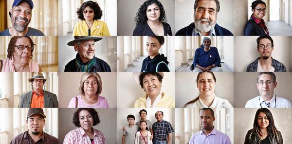
We met with IDEO designer Matt Adams to learn about his team’s efforts to pioneer a new voting experience in collaboration with Los Angeles County. L.A. County and IDEO set out to build a voting experience accessible to all—a system that meets the extraordinarily diverse needs of the county’s 5 million registered voters: individuals with literacy challenges, hearing and vision impairment, and supporting 10 different languages.
Matt discusses L.A. County’s determination to create a voting system that works for everyone and how IDEO used design thinking, empathic exercises, and prototyping to help the county create a new system that accommodates their voters and is adaptable for the future. Learn more about conducting empathic user research, prototyping, and iterating in our Insights for Innovation and From Ideas to Action courses.
----
Tell us a bit about what you’re currently doing at IDEO.
I tend to work on large, challenging projects where technology and human needs intersect. I help determine solutions, and then create a tangible product. I’m doing this now by leading a team both within IDEO, plus multiple partner companies, to help create a new voting system for and in collaboration with Los Angeles County.
Redesigning the voting system is an audacious project. It’s big for L.A. County because they’re trying to create a publicly-owned voting system, which has never been done before. But they have the confidence to do it in large part because of their size—they have more voters than 42 U.S. states. They’re the most populous county in the country and their scale means they have all types of voters they need to support.
Any accessibility challenge you can think of exists there and they need a system that’s scalable and works for all their voters. When they decided to replace their existing voting system, they found that nothing existed that met their specific requirements, and they realized they had to create their own.
L.A. County came to IDEO because they wanted to ensure the system had a human-centric lens. We completed the initial phase of work to define the concept for this new voting experience, but going from concept to something real is not trivial. There are countless decisions and tradeoffs to make as you work through the details of the design. That’s what we’re doing now, and when we’re finished the county will have a well-defined reference design.
Tell us a story about the creative team on the project. What drove the team and helped them thrive?
Two things drove our team: empathy for voters with disabilities and the process of prototyping and gathering feedback to keep momentum.
I’m still in awe that L.A. County had the audacity to take on this project. Voting is such a hot-button issue. There are groups in the voting community that advocate for different needs, from accessibility to security, to ensuring elections are run with integrity and accountability. Often the needs of these groups are in tension. The county’s approach has been to include representatives of these groups as advisors. So, we worked closely with our client, L.A. County, but also with their advisory committees.
------
“The world needs creativity because problems aren’t getting simpler. To me, with creativity we stop relying on what’s always been and open our eyes to what might be.”
------
Some of the design decisions we had to make were hotly debated for years. A great example is the question of an integrated ballot box. It’s commonly agreed a paper ballot a voter can check for accuracy before casting is the way to go. But it hadn’t been determined whether the ballot should be cast in a central box—the customary way—or in an integrated ballot box on the voting machine.
On one hand, an integrated ballot box makes it possible for voters who are blind, for example, to cast their ballot independently and anonymously using the accessibility features designed into the machine. On the other hand, there were doubts about whether voters would trust casting their ballot at the machine vs. in a communal box in the middle of the polling place.
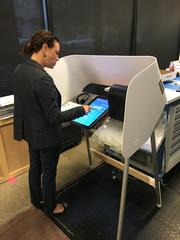
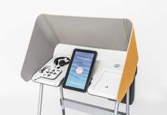
For our second user research phase, we built an early voting machine prototype that simulated the experience of making selections and printing a ballot. We had one group cast votes into an integrated ballot box, and one group cast votes into a central ballot box. We were curious if it would be a strange experience. Would it erode voter trust to cast a ballot in a machine and not know what’s happening to it? But we found it wasn’t an issue for most people.
Conducting that second phase of user research with a prototype to mimic the experience, gave us the feedback to answer this question people had argued over for years. What had once been theoretical became tangible, and that tangibility brought clarity.
Our latest version is a partially translucent ballot box. You can see the ballots going into it but you can’t see the text. This way it’s clear what’s happened to your ballot. The benefits are people can cast their ballot independently and we have a design that increases voter trust by addressing any concerns about what’s happening to the ballot.
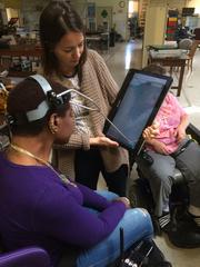
One of our goals was to make one experience that would work for everyone. We did a lot of prototyping with people with access challenges, including people who are blind and individuals with cerebral palsy.
Early on, we did an empathy exercise about what it’s like to live with disabilities. We visited one of the technical advisors, who is an electrical engineer and also happens to be blind. He lives in Santa Clara and took it upon himself to evaluate voting machines and write extensive reports about how they are incredibly frustrating for people who are blind.
We went to his house, talked to him, saw the stuff he was into and how he got around in the world. This was important to do at the beginning because we started to visualize what L.A. County was trying to accomplish and who they were trying to serve.
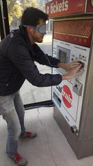
Another part of the empathy exercise was to set up interactions with different digital experiences. For example, I was blind in one exercise and had to buy a ticket at the Caltrain station. I also had to withdraw money from an ATM and figure out, without the benefit of sight, how do these machines work?
Much of the art of designing is in finding what to focus on, what needs to be your anchor. Early on, we knew designing something that worked well for everybody was an anchor. Once we understood that, the design was pretty basic, surprisingly simple.
Often as designers we want to make something that’s beautiful and has an innovative interaction—something new that’s never been seen before. We found pushing for the novel made the experience beautiful, but harder from some voters to use. On the flipside, everyone benefits from a voting experience that’s easy to use. In this case, being grounded in who we were designing for helped us focus, and that focus led to a design that is easy for everyone to use.
To speed up to today, what would you say the impact of the project has been on L.A. County?
The impact of the voting experience is going to be amazing. For voters who have been voting despite challenges at the polling locations, language or otherwise, they’re going to have an experience that works for them, one they never had before.

One person we spoke with, who was a postmaster until he lost his sight, said he hasn’t voted in years because it’s just too hard. With this change, now he’ll vote. There are people who didn’t vote before who will now be able to vote. What we created is going to allow the county to be more responsive to the needs of their people.
They own the design, and we designed it so the different pieces are modular. As the county learns, as they change, they can update pieces of the voting system to adapt to their growing needs without starting from scratch.
I’ve been to a number of election seminars and symposiums in D.C. and everyone’s talking about what L.A. County is doing—because they’re starting to do things that people have been talking about for years and they have the scale to make it happen.
The county intends to make the voting system open for other counties to use and modify. I think the impact will be to create the most accessible voting experience in the world.
Why do you think the world needs creativity now more than ever?
The world needs creativity because problems aren’t getting simpler. To me, with creativity we stop relying on what’s always been and open our eyes to what might be. As problems get more complex, I think there are fewer examples of how to solve them. Instead of looking at what is or what has been, we need to start looking to what can be.
I mean, it’s crazy to think about the L.A. County Clerk and Registrar Recorder. These guys do elections, marriage certificates, new businesses, and they’re doing deeply human centered work for voting systems. If they can do it, what’s everybody else’s excuse?
Tim Brown is leading an upcoming IDEO U course on leadership called Leading for Creativity. We talked a bit about creativity and why it’s important and I’m curious about your leadership style. What are some things you’re working on and how are you reshaping your leadership style?
I currently work with a lot of young talent. If I’m honest, I’m trying to hone the craft of giving critique, constructive feedback, in the moment. And I say this because I believe there’s no one way to design anything.
Part of the magic of having a project team is the combination of skills, passion, and experience that drive the design direction. My philosophy for creative leadership is to try and make space for people to bring things to the design that they care about. That part comes naturally to me. The part that doesn’t come naturally, is how to direct it when it goes awry. Because everybody on the team doesn’t always have the same perspective that you have, or the client has, or even another designer has.
“My philosophy for creative leadership is to try and make space for people to bring things to the design that they care about.”
The younger you are, the more siloed you are, or, the deeper you are in your team, the harder it can be to understand the different perspectives that join to create a solution. I think there are maybe three main components to help with this. One is creating the space to allow the person to be creative, and I think that’s a balance you can easily tip. Giving people autonomy is important to help them feel inspired and motivated, but at the same time you have to guide them. Being able to set a direction on what should anchor each design is big as well, and helping people get to the point where they can understand what’s important and buy into it. The part I’m working on, is when the designer is wondering what they need to do, how do you give those corrections? How do you give feedback in a way that helps guide both the project and the person?
Do you have any techniques that you use to bring people together in those moments?
This is something I’m working on and I do have a technique—I really like the Socratic method. I like people to discover what their design needs to be by asking questions about what it is they designed and how it will work in certain situations. I think it has to do with recognizing where the holes might be in the person’s perspective and finding questions to help them explore those holes.
If you had a magic wand to design a world where you could build creative confidence in people and help solve their challenges, what would you change?
If I could wave my magic wand, I’d make a filter so everyone knew how to deliver critique in a way that doesn’t kill confidence or initiative and doesn’t feel personal. I’d make all critique be delivered with a feeling of genuine interest in the person’s well being. While receiving critique often hurts self-esteem, in an ideal situation, critique would be perceived as a gift from someone trying to help—a way to encourage learning and growth.
----
Different Prototypes from the project:
- choosing a selection results in a full page refresh
- press the space key then arrow keys to make a selection


